
ON: Skincare
Description
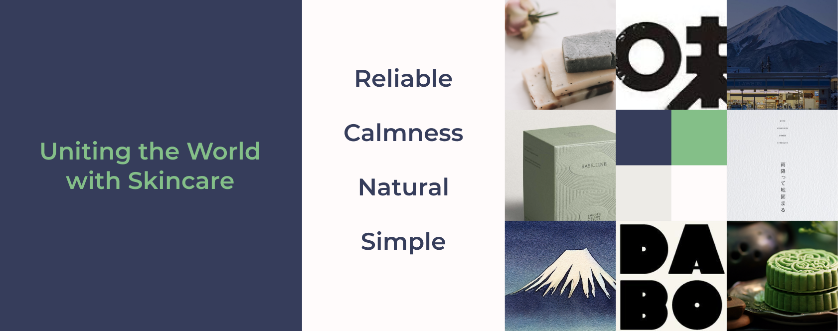
ON is a conceptual Japanese skincare brand with a global vision to unite the world with skincare. Their focus is to deliver reliable products. Their skincare products are thoughtfully crafted with natural ingredients to cleanse the skin, leaving behind a subtle and calming sensation that lingers long after use.
I built a brand identity that boldly pays homage to their values of reliability, harmony, and connection to the natural world.
Design
Illustration
Web Development
Roles & Responsibilities


The ‘N’ is redesigned to a rabbit which is tilted playfully to reveal a stable mountain akin to Mount Fuji.
The rabbit embodies Beauty, which is central to the brand's values and origins. The mountain signifies stability and calmness, reflecting the brand’s commitment to reliability in its products.
Blending animals and nature showcases the brand’s connection to the natural world, evident in its choice of ingredients.


I chose dusty colours to align with ON’s deep connection with nature. The white represents the cascading cleanliness effect that the company guarantees. The purple, green, and yellow aims to convey elements of the natural world.


Website
For the website, I envisioned the ambiance that ON aims to cultivate: one of cleanliness, elegance, reliability, and natural simplicity for their customers.
The website was also designed to highlight the beauty of their products while also showcasing the process and natural ingredients.

Lessons Learned
I learned that a well-chosen typeface was a game-changer. It acted as a powerful anchor, effectively capturing the essence of the brand and facilitating the creation of consistent visual collateral. It showed me the absolute importance of typography in conveying brand personality, enhancing readability, and contributing to the overall success of the brand’s visual strategy.
Early on, many assumptions were made during the design process, preventing me from truly understanding the target user when it comes to organic skincare. While this brief is conceptual, more research could be done with understanding user's preferences, behaviours, and needs, while developing a brand identity that could truly connect with the target audience.